How Much Art Can You Take?
Hardcore's rich artistic heritage and visual language speaks to who we are and what it is that we're doing at least as much as the music does. We don't acknowledge that nearly enough.
I.
If there is one photographer that defined the Anti-Matter aesthetic in the nineties, it was Chris Toliver. It’s likely that you’ve never heard his name: Chris abruptly quit photography and sold all of his cameras near the end of the decade. But while he was in the field, he was one of the best—consistently publishing photos that became deeply influential for so many of the hardcore photographers that followed. Chris’s work on records for Four Walls Falling, Shelter, and Strife, among others, popularized the “35mm full frame border” aesthetic that I used across every issue of Anti-Matter, for one thing. His style essentially set the tone for every other photographer who contributed to the zine.
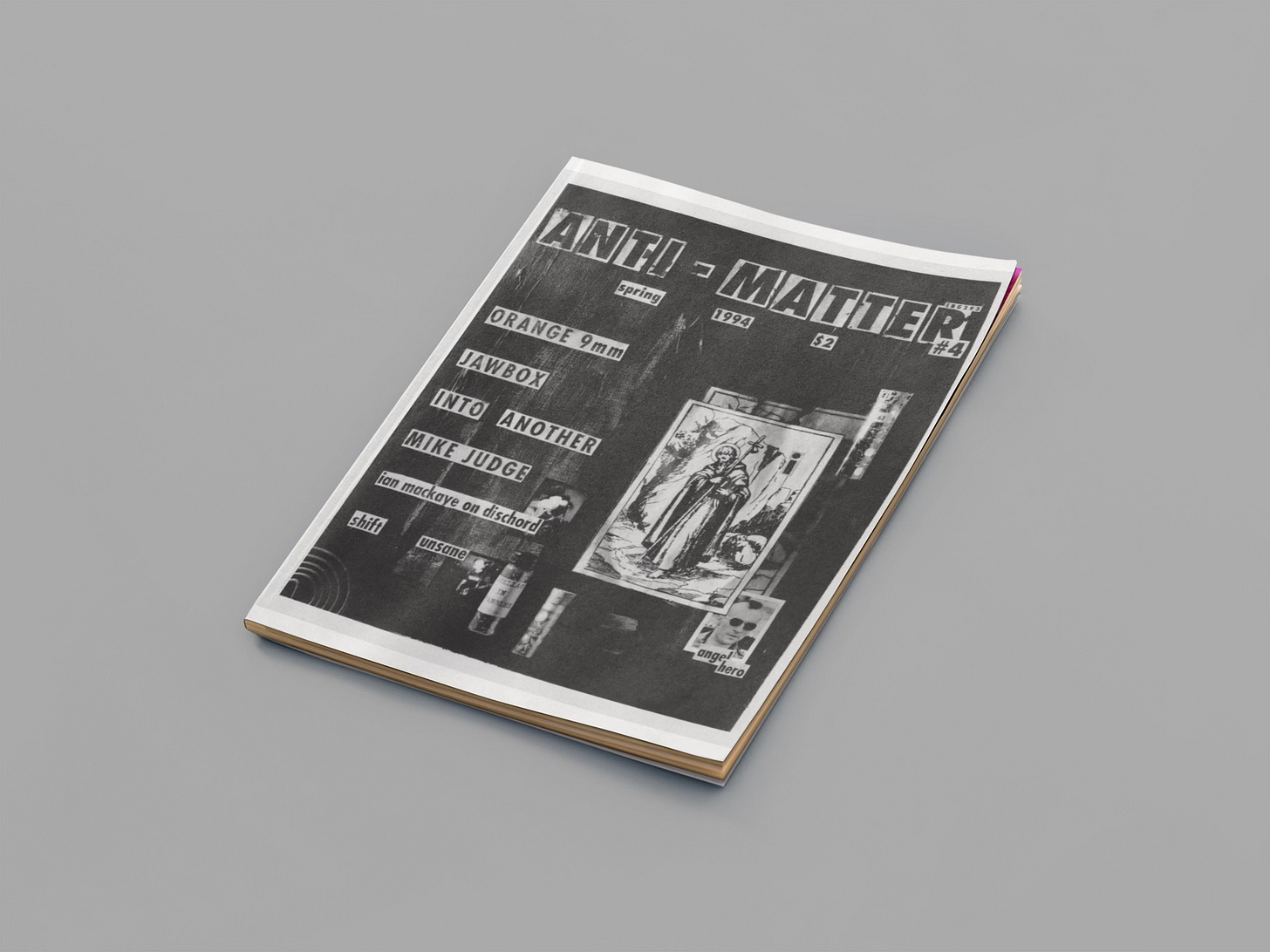
Even besides all that, there is still one contribution that Chris Toliver made to Anti-Matter that particularly stands out. In early 1994, as I was preparing Issue Four, he came to me with an idea: Simply “taking pictures” was starting to feel less creatively satisfying, and he was becoming more interested in the idea of creating images. For Chris, this meant literally building physical environments to shoot. It meant taking total control of every inch of the frame. His idea was to build an environment that was unique to that issue of Anti-Matter, to shoot photos of that environment, and to publish that photo for the cover.
I'm not so sure that every hardcore kid appreciated the nuances of art and visual identity thirty years ago in the way that we do now. These days, almost everyone has messed around with Canva or Photoshop; the apps on our phones have, for better and for worse, trained us to understand basic design and composition principles in ways that we never really thought about before home computers and smartphones became ubiquitous. So when this particular image came out on the cover of Anti-Matter, I always assumed that most people would perceive it to be a standard cut-and-paste job—not an original photo of an actual 3-D diorama. I didn’t make it a point to correct people, but I wish that I had. Because the textures and reflections and shadows and folds that you see are real. And that entire cover was a physical piece of art that existed to be photographed, and then demolished, and then reproduced in print. Whether or not anyone received it in that way, I can’t say. But the cover of that issue continues to be reproduced on the internet to this day, and that means something. Art is enduring in that way.
II.
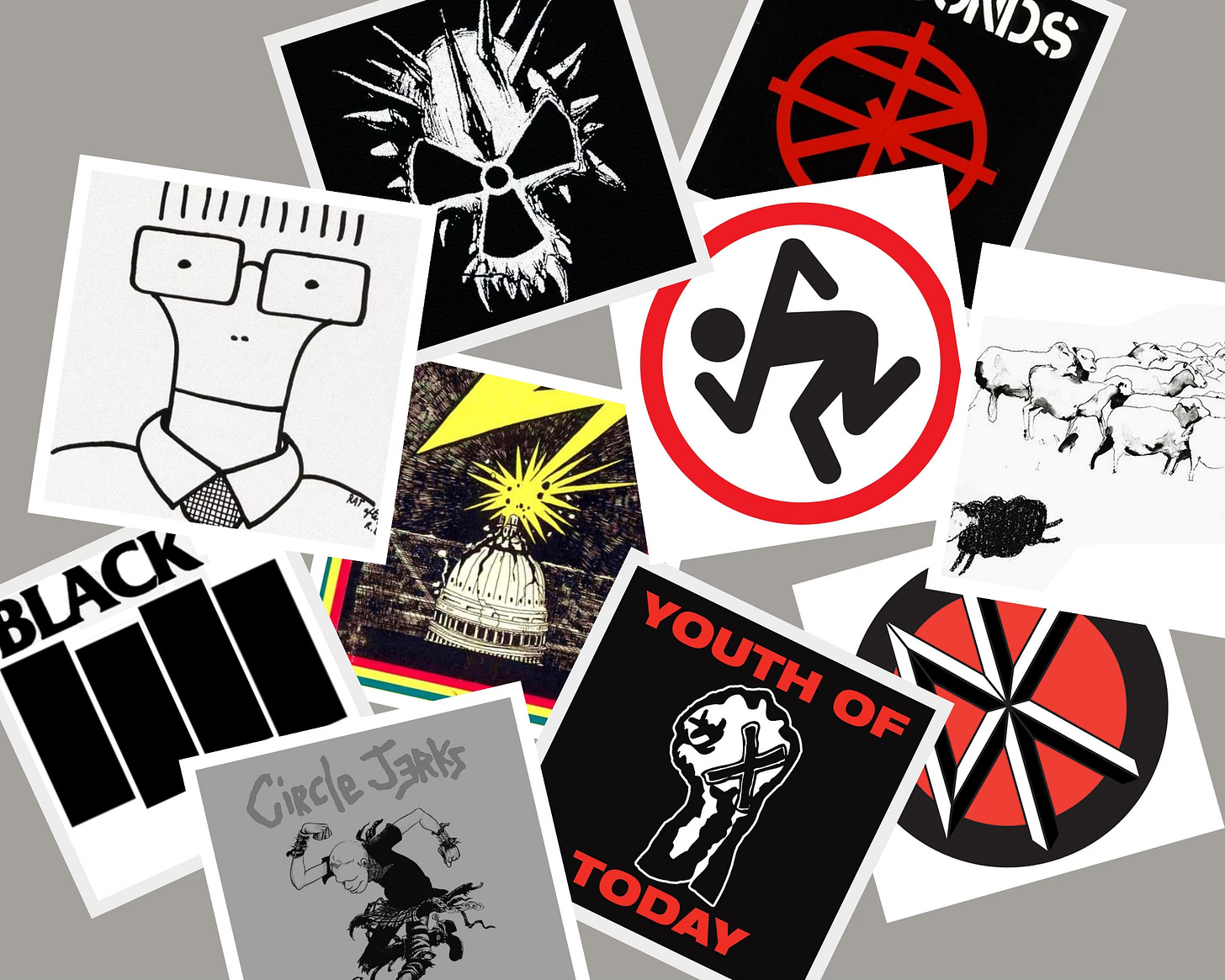
Every now and then, an artist from our community breaks through into the public consciousness. We know about Raymond Pettibon, who became famous for his work with Black Flag—including the band’s legendary “four bars” logo. We’ve heard of Sean Taggart, who came up in the scene drawing flyers for Sunday Matinees at CBGB before creating record covers in his unique illustrative style for Agnostic Front, Underdog, and Crumbsuckers, among others. We also know Pushead, whose work began with his own band, Septic Death, before branching out into graphic art for everyone from In My Eyes to Metallica. (Cleanse The Bacteria, a compilation album he put out in 1985, features legendary artwork in its own right.) But more often than not, it seems that we absorb a band or a zine’s visual identity as a part of our overall experience without going much deeper. It’s more of what I’d call an “ambient awareness”—an almost surface recognition that a visual identity exists, but one that takes for granted the fact that, somewhere, there was a person who created it.
For example, take a minute to think: Who drew the D.R.I. mosh guy? I have owned records and t-shirts and stickers with this graphic on it for almost 35 years now, and yet, when I tried to come up with an answer on my own, I couldn’t. The D.R.I. mosh guy, as far as I was concerned, has just always been there. But it turns out “the mosh guy” was designed by D.R.I.’s original drummer, Eric Brecht, who left the band in 1984. He drew it for a high school art project that tasked him with creating a “corporate” logo—and wound up creating one of the most indelible pieces of hardcore iconography ever.
Or wait: Who drew the Youth of Today fist? Again, it never occurred to me to ask. So the other day I reached out to Ray Cappo, by text, and did just that. I was somewhat stunned by his initial response. “No idea,” he said, flatly.
After a little more prodding, Cappo eventually told me about “a skinhead-looking guy” who used to live in Poughkeepsie, New York, that everyone called Herbie Straightedge. He got the nickname because that fist had been drawn on the back of his jacket with the word “straightedge” underneath. Youth of Today more or less just nicked the design and repurposed it. “He may have drawn it,” Cappo says now, but he never saw Herbie again after Youth of Today started to take off. Which is to say we may never really know for sure.

III.
This week’s conversation, with Andrew Kline of Strife and Berthold City, touches on this topic for an interesting reason: The name “Berthold City” itself is a very specific nod to a typeface that should be instantly recognizable to almost any hardcore kid. For the last 40 years, it’s been a font that has become tied to the identities of bands like SS Decontrol, Gorilla Biscuits, Side By Side, CIV, Chain of Strength, and many others. In our culture, Berthold City is a typeface that makes up part of an unspoken language we use to evoke American straight-edge hardcore—an association that its Berlin-based designer, Georg Trump, could never have imagined when he released it almost 100 years ago.
For Andrew, this connection between hardcore and its visual language stood at the forefront of his initial concept for Berthold City—so much so that he created an immediate partnership with Jeremy Dean, one of the hardcore scene’s best-known contemporary graphic designers, before even finishing the band’s first demo. (Says Andrew: “I basically told him: ‘I want you to be our Raymond Pettibon.’”) His relationship with hardcore art went beyond ambient awareness, and it started at the very beginning.
“To be honest, I would go back to seventh grade as a young kid,” he tells me, in a conversation that will be published in full on Thursday, “just taking a paint pen and drawing on the grip tape of my skateboard. And what do you do? You draw the D.R.I. mosh guy. That’s iconic. Maybe you draw Milo from the Descendents. That’s iconic. The 7 Seconds stencil logo. That’s iconic. The Corrosion of Conformity skull. I could probably still draw that right now. I would say the design of punk and hardcore is almost as important as the music because that’s the first thing you see. When you see a record in the store, you don’t hear it—you see the cover. Pre-streaming, that’s how I would pick what record I bought. I’d look at the cover, or maybe I’d look at the back cover and see the record label logo. That was enough to say, ‘OK, I’m going to shell out my eight dollars and I’m going to give this a shot.’ Sometimes it would be a winner and sometimes it would be a loser, but you didn’t know until you got home.”
It makes me wonder what we’re missing every time we attempt to discover a new record on a streaming platform, where the art inside of a one-inch square is somehow supposed to reveal something to us about who this band is or what this record is trying to tell us. Would a formative record for me, like Bedtime For Democracy, have changed my life in exactly the same way if I were never able to make out Winston Smith’s painstakingly detailed art through my phone?
IV.
While it’s true that artists, designers, and illustrators very rarely get mentioned whenever we talk about the pantheon of hardcore participants—a conversation where, let’s face it, bands take the lion’s share of attention (and credit!)—it’s also true that these artists, since the beginning, have worked tirelessly to create a visual canon that continues to articulate how we see ourselves and each other. It’s just a fact at this point that I can’t wear an SSD t-shirt without thinking about someone’s choice to use the Berthold City font. I can’t hear “Out Of Step” without seeing black sheep in my head. I can’t think about Bad Brains without seeing that legendary Glen E. Friedman photo of H.R., upside down in mid-air. All of these images capture something intangible about who we are and what it is that we do. They tell important stories. They contribute to meaning. At its best, hardcore art is at least as important as the music that we’ve organized our community around.
From artists and designers like Chris Toliver and Glenn Maryansky, who created handcrafted covers for this zine in the ‘90s, to Jesse Reed, who conceived and executed the project of designing a refreshed identity for Anti-Matter last year, to all of the photographers who contribute their incredible work to support this project, I have always depended on the talents of visual artists to enrich this zine by making the invisible visible. And I will be the first person to tell you that without their work, my work would feel painfully incomplete—if only because, often, when it comes to hardcore, you really only know it when you see it.
Coming on Thursday to Anti-Matter: A conversation with Andrew Kline of Berthold City and Strife.
Anti-Matter is an ad-free, anti-algorithm, completely reader-supported publication—personally crafted and delivered with care. If you’ve valued reading this and you want to help keep it going, please consider becoming a paid subscriber. ✨


Some logos simply transcend time and space.
*cough*SickOfItAllDragon*cough*
😬
It was the art, illustrations and photographs that drew me closer to punk and hardcore cassettes and vinyl. Once my attention was peaked, the riffs and lyrics sealed the deal.
All the artists and designers mentioned (as well as other folks like Art Chantry, Jake Bannon and Tim Singer) were headlights for my own dark and rocky road as a designer.